Javascript
Hands-on JavaScript projects and guides for building interactive websites.
In today's digital landscape, a website needs to do more than just provide information; it needs to captivate. Smooth, engaging animations are key to creating a memorable user experience, and there's no better tool for the job than GSAP (GreenSock Animation Platform).
GSAP is a robust JavaScript animation library that lets you create high-performance, complex, and beautiful animations with ease. It's incredibly versatile, working with CSS properties, SVG, Canvas, and any custom properties.
This post will explore 15 stunning GSAP effects, complete with HTML, CSS, and JavaScript, that you can implement on your website to elevate its design and user interaction. Prepare to transform your static pages into dynamic masterpieces!
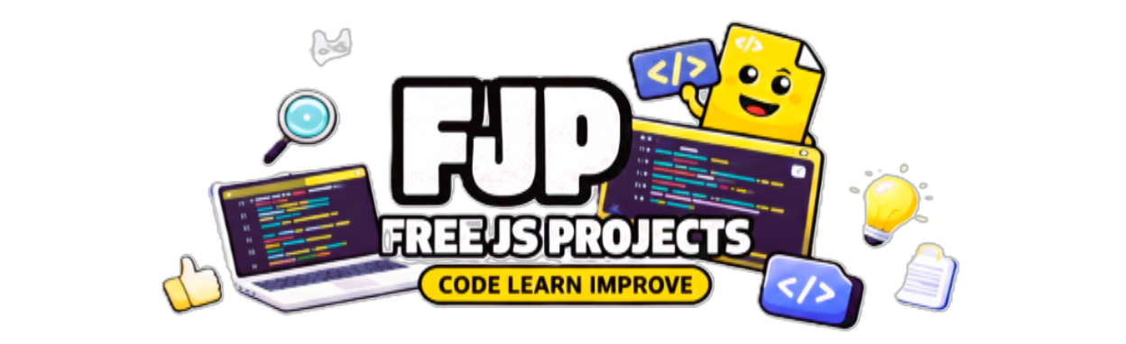
This effect brings a classic card element to life with a subtle 3D tilt and a dynamic radial glow that follows the user's cursor. It's perfect for product displays, portfolio items, or interactive call-to-action cards.
What it does:
3D Tilt: The card rotates slightly along the X and Y axes as the mouse moves over it, giving a sense of depth.
Mouse-Follow Glow: A gentle, radial light effect moves with the cursor, highlighting the card's surface.
Smooth Return: When the mouse leaves, the card smoothly springs back to its original position.
Why it's attractive: This effect adds a premium, interactive feel, making elements feel responsive and "touchable."
Preview:
HTML:
<div class="stage">
  <div class="card">
    <span>INTERACT</span>
  </div>
</div>
<script src='https://cdn.jsdelivr.net/npm/gsap@3/dist/gsap.min.js'></script>
CSS:
* {
  box-sizing: border-box;
}

html, body {
  margin: 0;
  height: 100%;
  background: #0a0c14;
  font-family: system-ui, sans-serif;
}

.stage {
  height: 100%;
  display: grid;
  place-items: center;
}

.card {
  width: 320px;
  height: 200px;
  background: linear-gradient(135deg, #111827, #020617);
  border-radius: 24px;
  display: grid;
  place-items: center;
  color: white;
  letter-spacing: 0.2em;
  position: relative;
  transform-style: preserve-3d;
  box-shadow:
    0 40px 80px rgba(0,0,0,0.6),
    inset 0 0 0 1px rgba(255,255,255,0.05);
}

.card::after {
  content: "";
  position: absolute;
  inset: 0;
  border-radius: inherit;
  background: radial-gradient(
    600px 300px at var(--mx, 50%) var(--my, 50%),
    rgba(255,255,255,0.08),
    transparent 60%
  );
  pointer-events: none;
}

.card span {
  position: relative;
  z-index: 1;
  font-size: 14px;
}
Javascript:
const card = document.querySelector(".card");

let bounds;
let mouse = { x: 0, y: 0 };

function calculateBounds() {
  bounds = card.getBoundingClientRect();
}
calculateBounds();
window.addEventListener("resize", calculateBounds);

card.addEventListener("mousemove", (e) => {
  mouse.x = e.clientX - bounds.left - bounds.width / 2;
  mouse.y = e.clientY - bounds.top - bounds.height / 2;

  const rotateX = gsap.utils.clamp(-15, 15, -mouse.y / 10);
  const rotateY = gsap.utils.clamp(-15, 15, mouse.x / 10);

  gsap.to(card, {
    x: mouse.x * 0.15,
    y: mouse.y * 0.15,
    rotateX,
    rotateY,
    duration: 0.4,
    ease: "power3.out"
  });

  card.style.setProperty("--mx", `${(e.clientX - bounds.left)}px`);
  card.style.setProperty("--my", `${(e.clientY - bounds.top)}px`);
});

card.addEventListener("mouseleave", () => {
  gsap.to(card, {
    x: 0,
    y: 0,
    rotateX: 0,
    rotateY: 0,
    duration: 0.8,
    ease: "elastic.out(1, 0.4)"
  });
});
This effect takes the interactive card concept a step further by introducing multiple layers that shift at different speeds, creating a mesmerizing parallax depth. A radiant glow follows the cursor, adding to the futuristic aesthetic.
What it does:
Multi-Layer Parallax: Different layers within the card (background, glow, content) move independently based on cursor position, creating a convincing 3D depth effect.
Dynamic Glow: A prominent radial glow layer moves quickly behind the content, emphasizing interactivity.
Weighted Animation: GSAP's easing functions (power3.out, power2.out) are used to give each layer a distinct "feel" and speed.
Why it's attractive: It provides a sophisticated visual experience, making UI elements feel alive and responsive to user input, perfect for hero cards or interactive banners.
Preview:

HTML:
<div class="stage">
  <div class="card">
    <div class="layer bg"></div>
    <div class="layer glow"></div>
    <div class="layer content">
      <h3>FUTURE UI</h3>
      <p>Temporal Drift</p>
    </div>
  </div>
</div>

<script src='https://cdn.jsdelivr.net/npm/gsap@3/dist/gsap.min.js'></script>
CSS:
* {
  box-sizing: border-box;
}

html, body {
  margin: 0;
  height: 100%;
  background: #070911;
  font-family: system-ui, sans-serif;
}

.stage {
  height: 100%;
  display: grid;
  place-items: center;
}

.card {
  width: 360px;
  height: 220px;
  position: relative;
  border-radius: 26px;
  overflow: hidden;
  background: #0b0e1a;
  box-shadow: 0 40px 90px rgba(0,0,0,0.65);
  transform-style: preserve-3d;
}

.layer {
  position: absolute;
  inset: 0;
}

.bg {
  background: linear-gradient(120deg, #0f172a, #020617);
}

.glow {
  background: radial-gradient(
      500px 200px at var(--gx, 50%) var(--gy, 50%),
      rgba(56,189,248,0.25),
      transparent 60%
    );
  mix-blend-mode: screen;
}

.content {
  display: grid;
  place-items: center;
  text-align: center;
  color: #e5e7eb;
  letter-spacing: 0.15em;
}

.content h3 {
  margin: 0;
  font-size: 18px;
}

.content p {
  margin: 6px 0 0;
  font-size: 11px;
  opacity: 0.7;
}
Javascript:
const card = document.querySelector(".card");

const bg = document.querySelector(".bg");

const glow = document.querySelector(".glow");

const content = document.querySelector(".content");

let bounds;

function updateBounds() {
  bounds = card.getBoundingClientRect();
}

updateBounds();

window.addEventListener("resize", updateBounds);

card.addEventListener("mousemove", (e) => {
  const x = e.clientX - bounds.left - bounds.width / 2;
  const y = e.clientY - bounds.top - bounds.height / 2;
  const nx = x / bounds.width;
  const ny = y / bounds.height;

  // Background (slow, heavy)

  gsap.to(bg, {
    x: nx * 20,
    y: ny * 20,
    duration: 0.8,
    ease: "power3.out"
  });

  // Glow (fast, light)

  gsap.to(glow, {
    x: nx * 40,
    y: ny * 40,
    duration: 0.3,
    ease: "power2.out"
  });

  // Content (medium delay)

  gsap.to(content, {
    x: nx * 30,
    y: ny * 30,
    duration: 0.5,
    ease: "power3.out"
  });

  card.style.setProperty("--gx", `${e.clientX - bounds.left}px`);
  card.style.setProperty("--gy", `${e.clientY - bounds.top}px`);
});

card.addEventListener("mouseleave", () => {
  gsap.to([bg, glow, content], {
    x: 0,
    y: 0,
    duration: 1,
    ease: "expo.out"
  });
});
This effect turns your headlines into a playground. As the user moves their mouse, the individual letters react as if pushed by an invisible force, scattering slightly and then snapping back.
What it does:
Letter Splitting: Automatically wraps every character in a <span> to animate them individually.
Proximity Force: Calculates the distance between the cursor and each letter; the closer the mouse, the more the letter "shies away."
Smooth Snap: When the mouse moves away, the letters use a powerful "expo.out" ease to return to their perfect alignment.
Why it's attractive: It makes text feel physical and interactive rather than static. It’s perfect for landing pages that want to showcase "innovation."
Preview:

HTML:
<div class="stage">
  <h1 class="kinetic">FUTURE INTERACTION</h1>
</div>
<script src='https://cdn.jsdelivr.net/npm/gsap@3/dist/gsap.min.js'></script>
CSS:
html, body {
  margin: 0;
  height: 100%;
  background: #05070c;
  font-family: system-ui, sans-serif;
}

.stage {
  height: 100%;
  display: grid;
  place-items: center;
}

.reveal {
  position: relative;
  width: 520px;
  height: 320px;
  background: #020617;
  overflow: hidden;
  border-radius: 24px;
  box-shadow: 0 40px 80px rgba(0,0,0,0.6);
}

.reveal h1 {
  position: absolute;
  inset: 0;
  margin: 0;
  padding: 48px;
  font-size: 42px;
  line-height: 1.05;
  letter-spacing: 0.15em;
  color: #e5e7eb;
  z-index: 1;
}

.mask {
  position: absolute;
  inset: 0;
  background: radial-gradient(
    120px 120px at var(--mx, 50%) var(--my, 50%),
    rgba(255,255,255,1),
    rgba(255,255,255,0) 65%
  );
  mix-blend-mode: destination-out;
  pointer-events: none;
}
* {
  box-sizing: border-box;
}

html, body {
  margin: 0;
  height: 100%;
  background: #05060c;
  font-family: system-ui, sans-serif;
}

.stage {
  height: 100%;
  display: grid;
  place-items: center;
}

.kinetic {
  font-size: 64px;
  letter-spacing: 0.12em;
  color: #e5e7eb;
  display: flex;
}

.kinetic span {
  display: inline-block;
  will-change: transform;
}
Javascript:
const text = document.querySelector(".kinetic");
const letters = [...text.textContent].map(char => {
  const span = document.createElement("span");
  span.textContent = char === " " ? "\u00A0" : char;
  text.appendChild(span);
  return span;
});
text.firstChild.remove();

const positions = letters.map(letter => {
  const r = letter.getBoundingClientRect();
  return { x: r.left + r.width / 2, y: r.top + r.height / 2 };
});

window.addEventListener("mousemove", e => {
  letters.forEach((letter, i) => {
    const dx = e.clientX - positions[i].x;
    const dy = e.clientY - positions[i].y;
    const dist = Math.sqrt(dx * dx + dy * dy);

    const force = Math.max(0, 120 - dist);

    gsap.to(letter, {
      x: -dx * force * 0.002,
      y: -dy * force * 0.002,
      duration: 0.4,
      ease: "power3.out"
    });
  });
});

window.addEventListener("mouseleave", () => {
  gsap.to(letters, {
    x: 0,
    y: 0,
    duration: 1,
    ease: "expo.out"
  });
});Inspired by futuristic UI and gaming aesthetics, this glitch effect creates a high-energy "error" animation on hover. It uses overlapping layers of color to simulate RGB splitting.
What it does:
Layer Splitting: Uses three spans stacked on top of each other.
RGB Shift: On hover, the red and cyan layers are revealed and vibrated rapidly using yoyo: true and a very short duration.
Random Vibration: GSAP kills previous animations and restarts a fresh "shake" every time the mouse enters.
Why it's attractive: It provides instant, high-intensity feedback to the user, ideal for "Experiments" or "Labs" sections of a site.
Preview:

HTML:
<div class="stage">
  <div class="glitch">
    <span>EXPERIMENT</span>
    <span>EXPERIMENT</span>
    <span>EXPERIMENT</span>
  </div>
</div>

<script src='https://cdn.jsdelivr.net/npm/gsap@3/dist/gsap.min.js'></script>* {
  box-sizing: border-box;
}
CSS:
html, body {
  margin: 0;
  height: 100%;
  background: #020202;
  font-family: system-ui, sans-serif;
}

.stage {
  height: 100%;
  display: grid;
  place-items: center;
}

.glitch {
  position: relative;
  font-size: 64px;
  letter-spacing: 0.2em;
  color: white;
  cursor: pointer;
}

.glitch span {
  position: absolute;
  top: 0;
  left: 0;
}

.glitch span:nth-child(1) {
  position: relative;
}

.glitch span:nth-child(2) {
  color: #ff003c;
  clip-path: inset(0 0 60% 0);
  opacity: 0;
}

.glitch span:nth-child(3) {
  color: #00f6ff;
  clip-path: inset(60% 0 0 0);
  opacity: 0;
}
Javascript:
const glitch = document.querySelector(".glitch");
const layers = glitch.querySelectorAll("span");

glitch.addEventListener("mouseenter", () => {
  gsap.killTweensOf(layers);

  gsap.set(layers[1], { x: -12, opacity: 1 });
  gsap.set(layers[2], { x: 12, opacity: 1 });

  gsap.to(layers[1], {
    x: 8,
    duration: 0.08,
    repeat: 3,
    yoyo: true
  });

  gsap.to(layers[2], {
    x: -8,
    duration: 0.06,
    repeat: 4,
    yoyo: true
  });
});

glitch.addEventListener("mouseleave", () => {
  gsap.to(layers[1], {
    x: 0,
    opacity: 0,
    duration: 0.15
  });

  gsap.to(layers[2], {
    x: 0,
    opacity: 0,
    duration: 0.15
  });
});
This is a high-end fashion or magazine-style effect. It breaks an image into vertical slices and shifts them in alternating directions on hover.
What it does:
CSS Background Positioning: Each "slice" div displays a piece of the same background image using background-position-x.
Alternating Movement: GSAP moves the 1st and 3rd slices up, while moving the 2nd and 4th slices down.
Staggered Reset: Uses expo.out to snap back elegantly.
Why it's attractive: It creates a unique "shutter" or "venetian blind" transition that feels expensive and artistic.
Preview:

HTML:
<div class="stage">
  <div class="slice-card">
    <div class="slice s1"></div>
    <div class="slice s2"></div>
    <div class="slice s3"></div>
    <div class="slice s4"></div>
    <div class="label">EDITORIAL</div>
  </div>
</div>

<script src='https://cdn.jsdelivr.net/npm/gsap@3/dist/gsap.min.js'></script>
CSS:
* {
  box-sizing: border-box;
}

html, body {
  margin: 0;
  height: 100%;
  background: #05070c;
  font-family: system-ui, sans-serif;
}

.stage {
  height: 100%;
  display: grid;
  place-items: center;
}

.slice-card {
  position: relative;
  width: 420px;
  height: 280px;
  cursor: pointer;
  overflow: hidden;
}

.slice {
  position: absolute;
  top: 0;
  bottom: 0;
  width: 25%;
  background-image: url("https://images.unsplash.com/photo-1526779259212-939e64788e3c?q=80&w=1174&auto=format&fit=crop&ixlib=rb-4.1.0&ixid=M3wxMjA3fDB8MHxwaG90by1wYWdlfHx8fGVufDB8fHx8fA%3D%3D");
  background-size: 400% 100%;
  background-position-y: center;
}

.s1 { left: 0;   background-position-x: 0%; }
.s2 { left: 25%; background-position-x: 33.33%; }
.s3 { left: 50%; background-position-x: 66.66%; }
.s4 { left: 75%; background-position-x: 100%; }

.label {
  position: absolute;
  inset: 0;
  display: grid;
  place-items: center;
  color: #e5e7eb;
  letter-spacing: 0.35em;
  font-size: 14px;
  pointer-events: none;
}
Javascript:
const card = document.querySelector(".slice-card");
const slices = card.querySelectorAll(".slice");

card.addEventListener("mouseenter", () => {
  gsap.to(slices[0], { y: -20, duration: 0.6, ease: "power3.out" });
  gsap.to(slices[1], { y: 15,  duration: 0.6, ease: "power3.out" });
  gsap.to(slices[2], { y: -10, duration: 0.6, ease: "power3.out" });
  gsap.to(slices[3], { y: 20,  duration: 0.6, ease: "power3.out" });
});

card.addEventListener("mouseleave", () => {
  gsap.to(slices, {
    y: 0,
    duration: 0.8,
    ease: "expo.out"
  });
});Brutalist design is all about raw, unpolished energy. This effect takes a line of text and "breaks" it into jagged, rotating chunks that shake violently on hover.
What it does:
Randomization: Uses gsap.utils.random to ensure that every "tear" is different every time you hover.
Micro-Bursts: A secondary animation creates "bursts" of movement on the X-axis for a high-frequency jitter.
Hard Snap: Unlike the other smooth effects, this uses ease: "none" to keep it feeling sharp and aggressive.
Why it's attractive: It’s loud and bold. It works perfectly for creative agencies or portfolio headers that want to stand out from "safe" corporate designs.
Preview:

HTML:
<div class="brutal-wrap">
  <div class="brutal-line">
    <span class="chunk c1">CREATIVE</span>
    <span class="chunk c2">PORTFOLIO</span>
    <span class="chunk c3">ARCHIVE</span>
  </div>
</div>

<script src='https://cdn.jsdelivr.net/npm/gsap@3/dist/gsap.min.js'></script>
CSS:
* {
  box-sizing: border-box;
}

html, body {
  margin: 0;
  height: 100%;
  background: #000;
  font-family: Arial, Helvetica, sans-serif;
}

.brutal-wrap {
  height: 100%;
  display: grid;
  place-items: center;
}

.brutal-line {
  display: flex;
  gap: 24px;
  cursor: pointer;
}

.chunk {
  font-size: clamp(28px, 6vw, 80px);
  font-weight: 900;
  color: #fff;
  white-space: nowrap;
  display: inline-block;
}
Javascript:
const line = document.querySelector(".brutal-line");
const chunks = document.querySelectorAll(".chunk");

line.addEventListener("mouseenter", () => {
  gsap.killTweensOf(chunks);

  chunks.forEach((chunk, i) => {
    gsap.to(chunk, {
      y: gsap.utils.random(-40, 40),
      rotation: gsap.utils.random(-8, 8),
      duration: 0.12,
      ease: "none"
    });

    // micro tearing bursts
    gsap.to(chunk, {
      x: () => gsap.utils.random(-20, 20),
      duration: 0.05,
      repeat: 3,
      yoyo: true,
      ease: "none"
    });
  });
});

line.addEventListener("mouseleave", () => {
  // hard snap reset
  gsap.to(chunks, {
    x: 0,
    y: 0,
    rotation: 0,
    duration: 0.15,
    ease: "none"
  });
});A staple in modern luxury portfolios. Instead of just hovering, the button feels "magnetized" to the cursor, pulling toward it within a specific radius.
What it does:
getBoundingClientRect() to find the center point of the button.elastic.out ease, which creates a "boing" effect as it returns to its origin.0.3 to ensure the button follows the mouse without feeling too "heavy" or distracting.Why it’s attractive: It provides a playful, high-end feel to navigation and CTAs.
Preview:

HTML:
<div class="page">
  <button class="magnetic">
    Hover Me
  </button>
</div>

<script src='https://cdn.jsdelivr.net/npm/gsap@3/dist/gsap.min.js'></script>
CSS:
* {
  box-sizing: border-box;
}

html, body {
  margin: 0;
  height: 100%;
  font-family: system-ui, sans-serif;
  background: #0f172a;
}

.page {
  height: 100%;
  display: grid;
  place-items: center;
}

.magnetic {
  padding: 18px 42px;
  font-size: 16px;
  background: #38bdf8;
  color: #020617;
  border: none;
  border-radius: 10px;
  cursor: pointer;
  font-weight: 600;
  position: relative;
  will-change: transform;
}
Javascript:
const btn = document.querySelector(".magnetic");

let bounds;

function calculateBounds() {
  bounds = btn.getBoundingClientRect();
}
calculateBounds();
window.addEventListener("resize", calculateBounds);

btn.addEventListener("mousemove", (e) => {
  const x = e.clientX - bounds.left - bounds.width / 2;
  const y = e.clientY - bounds.top - bounds.height / 2;

  gsap.to(btn, {
    x: x * 0.3,
    y: y * 0.3,
    duration: 0.4,
    ease: "power3.out"
  });
});

btn.addEventListener("mouseleave", () => {
  gsap.to(btn, {
    x: 0,
    y: 0,
    duration: 0.6,
    ease: "elastic.out(1, 0.4)"
  });
});Standard browser tooltips are boring. This GSAP version creates a fluid, scaling tooltip that tracks the mouse with a slight lag, making it feel organic.
What it does:
Data Attribute: Pulls the text directly from the button's data-text attribute.
Cursor Tracking: The tooltip follows the mouse clientX and clientY with a +14px offset to prevent the cursor from overlapping the text.
Scale Animation: It scales up from 0.8 to 1 when appearing, giving it a "pop" effect.
Why it’s attractive: It keeps important information right where the user is looking without cluttering the UI.
Preview:

HTML:
<div class="page">
  <button class="info-btn" data-text="This is a GSAP tooltip">
    Hover me
  </button>
  <div class="tooltip"></div>
</div>

<script src='https://cdn.jsdelivr.net/npm/gsap@3/dist/gsap.min.js'></script>
CSS:
* {
  box-sizing: border-box;
}

html, body {
  margin: 0;
  height: 100%;
  font-family: system-ui, sans-serif;
  background: #0f172a;
}

.page {
  height: 100%;
  display: grid;
  place-items: center;
}

.info-btn {
  padding: 16px 36px;
  font-size: 16px;
  background: #38bdf8;
  color: #020617;
  border: none;
  border-radius: 8px;
  cursor: pointer;
  font-weight: 600;
}

.tooltip {
  position: fixed;
  top: 0;
  left: 0;
  padding: 8px 14px;
  background: #020617;
  color: #e5e7eb;
  font-size: 13px;
  border-radius: 6px;
  pointer-events: none;
  opacity: 0;
  transform: translate(-50%, -50%);
  white-space: nowrap;
}
Javascript:
const btn = document.querySelector(".info-btn");
const tooltip = document.querySelector(".tooltip");

btn.addEventListener("mouseenter", () => {
  tooltip.textContent = btn.dataset.text;

  gsap.to(tooltip, {
    opacity: 1,
    scale: 1,
    duration: 0.2,
    ease: "power2.out"
  });
});

btn.addEventListener("mouseleave", () => {
  gsap.to(tooltip, {
    opacity: 0,
    scale: 0.8,
    duration: 0.2,
    ease: "power2.out"
  });
});

btn.addEventListener("mousemove", (e) => {
  gsap.to(tooltip, {
    x: e.clientX + 14,
    y: e.clientY + 14,
    duration: 0.3,
    ease: "power3.out"
  });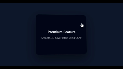
});This utilizes the famous ScrollTrigger plugin. Instead of everything appearing at once, elements slide and fade into view as the user scrolls down the page.
What it does:
Batch Selection: Uses gsap.utils.toArray to find all boxes at once.
Scroll Triggering: The start: "top 80%" means the animation begins when the top of the box hits 80% of the viewport height.
Reversible: The toggleActions allow the animation to reverse if the user scrolls back up.
Why it’s attractive: It creates a narrative flow, rewarding the user for exploring the page.
Preview:

HTML:
<div class="page">
  <section class="spacer">Scroll Down</section>
  <section class="content">
    <div class="box">Fast Performance</div>
    <div class="box">Smooth Animations</div>
    <div class="box">Modern Interaction</div>
  </section>
  <section class="spacer"></section>
</div>

<script src='https://cdn.jsdelivr.net/npm/gsap@3/dist/gsap.min.js'></script>
<script src='https://cdn.jsdelivr.net/npm/gsap@3/dist/ScrollTrigger.min.js'></script>
CSS:
* {
  box-sizing: border-box;
}

html, body {
  margin: 0;
  font-family: system-ui, sans-serif;
  background: #0f172a;
  color: #e5e7eb;
}

.page {
  min-height: 200vh;
}

.spacer {
  height: 80vh;
  display: grid;
  place-items: center;
  font-size: 24px;
  opacity: 0.4;
}

.content {
  max-width: 900px;
  margin: auto;
  padding: 60px 20px;
}

.box {
  background: #020617;
  padding: 40px;
  margin-bottom: 32px;
  border-radius: 12px;
  font-size: 22px;
  opacity: 0;
  transform: translateY(60px);
}
Javascript:
gsap.registerPlugin(ScrollTrigger);

gsap.utils.toArray(".box").forEach((box) => {
  gsap.to(box, {
    opacity: 1,
    y: 0,
    duration: 0.8,
    ease: "power3.out",
    scrollTrigger: {
      trigger: box,
      start: "top 80%",
      toggleActions: "play none none reverse"
    }
  });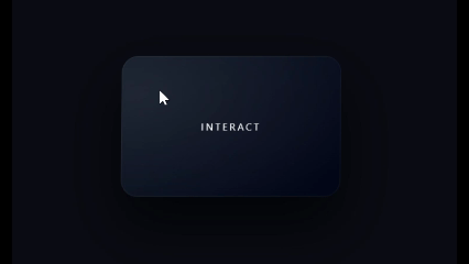
});Similar to the first effect but focused on pure perspective. It turns a flat card into a 3D object that tilts based on the quadrant of the mouse.
What it does:
Perspective Math: It calculates the distance from the center and divides by 15 to get a subtle rotation degree.
Transform Style: Uses preserve-3d in CSS to ensure the card doesn't flatten during rotation.
Why it’s attractive: It’s subtle enough for professional business sites but interactive enough to be memorable.
Preview:
HTML:
<div class="page">
  <div class="card">
    <h3>Premium Feature</h3>
    <p>Smooth 3D hover effect using GSAP</p>
  </div>
</div>

<script src='https://cdn.jsdelivr.net/npm/gsap@3/dist/gsap.min.js'></script>
CSS:
* {
  box-sizing: border-box;
}

html, body {
  margin: 0;
  height: 100%;
  font-family: system-ui, sans-serif;
  background: #0f172a;
  color: #e5e7eb;
}

.page {
  height: 100%;
  display: grid;
  place-items: center;
  perspective: 1000px;
}

.card {
  width: 320px;
  height: 250px;
  padding: 32px;
  background: #020617;
  border-radius: 16px;
  box-shadow: 0 30px 60px rgba(0,0,0,0.4);
  transform-style: preserve-3d;
  cursor: pointer;
  display: flex;
  flex-direction: column;
  justify-content: center;
text-align: center;
}

.card h3 {
  margin: 0 0 12px;
  font-size: 22px;
}

.card p {
  margin: 0;
  opacity: 0.7;
}
Javascript:
const card = document.querySelector(".card");

let bounds;

function updateBounds() {
  bounds = card.getBoundingClientRect();
}
updateBounds();
window.addEventListener("resize", updateBounds);

card.addEventListener("mousemove", (e) => {
  const x = e.clientX - bounds.left;
  const y = e.clientY - bounds.top;

  const centerX = bounds.width / 2;
  const centerY = bounds.height / 2;

  const rotateX = -(y - centerY) / 15;
  const rotateY = (x - centerX) / 15;

  gsap.to(card, {
    rotateX,
    rotateY,
    duration: 0.4,
    ease: "power3.out"
  });
});

card.addEventListener("mouseleave", () => {
  gsap.to(card, {
    rotateX: 0,
    rotateY: 0,
    duration: 0.8,
    ease: "elastic.out(1, 0.4)"
  });
});Standard image hovers just scale up. This effect goes deeper: it scales the image while simultaneously panning it based on your mouse position, making the viewer feel like they are exploring the photo.
What it does:
Inner Container Logic: The image is slightly larger than its container (110%), allowing room for it to move without showing white space.
Coordinate Mapping: Maps the mouse position to a specific X/Y offset.
Elastic Reset: Returns to center with an expo.out ease for a professional "settle."
Why it’s attractive: It’s an elegant way to show off high-quality photography in portfolios or e-commerce.
Preview:

HTML:
<div class="page">
  <div class="image-card">
    <img src="https://images.unsplash.com/photo-1526779259212-939e64788e3c?q=80&w=1174&auto=format&fit=crop&ixlib=rb-4.1.0&ixid=M3wxMjA3fDB8MHxwaG90by1wYWdlfHx8fGVufDB8fHx8fA%3D%3D" />
  </div>
</div>

<script src="https://cdn.jsdelivr.net/npm/gsap@3/dist/gsap.min.js"></script>
CSS:
* {
  box-sizing: border-box;
}

html, body {
  margin: 0;
  height: 100%;
  font-family: system-ui, sans-serif;
  background: #0f172a;
}

.page {
  height: 100%;
  display: grid;
  place-items: center;
}

.image-card {
  width: 360px;
  height: 240px;
  overflow: hidden;
  border-radius: 16px;
  cursor: pointer;
  background: #020617;
}

.image-card img {
  width: 110%;
  height: 110%;
  object-fit: cover;
  transform: translate(-5%, -5%) scale(1);
  will-change: transform;
}
Javascript:
const card = document.querySelector(".image-card");
const image = card.querySelector("img");

let bounds;

function updateBounds() {
  bounds = card.getBoundingClientRect();
}
updateBounds();
window.addEventListener("resize", updateBounds);

card.addEventListener("mouseenter", () => {
  gsap.to(image, {
    scale: 1.15,
    duration: 0.8,
    ease: "power3.out"
  });
});

card.addEventListener("mousemove", (e) => {
  const x = e.clientX - bounds.left;
  const y = e.clientY - bounds.top;

  const moveX = (x / bounds.width - 0.5) * 20;
  const moveY = (y / bounds.height - 0.5) * 20;

  gsap.to(image, {
    x: moveX,
    y: moveY,
    duration: 0.6,
    ease: "power3.out"
  });
});

card.addEventListener("mouseleave", () => {
  gsap.to(image, {
    x: 0,
    y: 0,
    scale: 1,
    duration: 0.9,
    ease: "expo.out"
  });
});A bulky header can ruin a user's reading experience. This effect uses ScrollTrigger to shrink the header and the logo as soon as the user starts scrolling down.
What it does:
Scrubbing: The scrub: true property links the animation progress directly to the scrollbar position.
Multi-Property Tween: Simultaneously changes the height, padding, and fontSize for a perfectly synchronized transition.
End Point: The animation completes exactly after the user has scrolled 200 pixels.
Why it’s attractive: It maximizes screen space for content while keeping navigation accessible.
Preview:
HTML:
<header class="site-header">
  <div class="logo">MyBlog</div>
  <nav class="nav">
    <a href="#">Home</a>
    <a href="#">Blog</a>
    <a href="#">Contact</a>
  </nav>
</header>

<main class="content">
  <section class="section">Scroll Down</section>
  <section class="section">More Content</section>
  <section class="section">More Content</section>
</main>

<script src="https://cdn.jsdelivr.net/npm/gsap@3/dist/gsap.min.js"></script>
<script src="https://cdn.jsdelivr.net/npm/gsap@3/dist/ScrollTrigger.min.js"></script>
CSS:
* {
  box-sizing: border-box;
}

html, body {
  margin: 0;
  font-family: system-ui, sans-serif;
  background: #0f172a;
  color: #e5e7eb;
}

.site-header {
  position: fixed;
  top: 0;
  left: 0;
  right: 0;
  height: 96px;
  padding: 0 32px;
  background: #020617;
  display: flex;
  align-items: center;
  justify-content: space-between;
  z-index: 1000;
}

.logo {
  font-size: 24px;
  font-weight: 700;
}

.nav a {
  margin-left: 24px;
  text-decoration: none;
  color: #e5e7eb;
  font-size: 14px;
}

.content {
  padding-top: 120px;
}

.section {
  height: 100vh;
  display: grid;
  place-items: center;
  font-size: 32px;
  opacity: 0.4;
}
Javascript:
gsap.registerPlugin(ScrollTrigger);

gsap.to(".site-header", {
  height: 64,
  paddingLeft: 24,
  paddingRight: 24,
  ease: "none",
  scrollTrigger: {
    trigger: ".content",
    start: "top top",
    end: "top+=200 top",
    scrub: true
  }
});

gsap.to(".logo", {
  fontSize: 18,
  ease: "none",
  scrollTrigger: {
    trigger: ".content",
    start: "top top",
    end: "top+=200 top",
    scrub: true
  }
});This is a "Big Brand" navigation style. When the menu opens, the links slide up one by one in a staggered sequence, and on hover, they feature a custom skew and underline effect.
What it does:
Timelines: Uses gsap.timeline() to ensure the menu slides in before the links appear.
Stagger: The stagger: 0.1 property creates that signature "one-after-another" look.
CSS Variables: GSAP animates custom CSS variables (--line, --bg) for the hover effects.
Why it’s attractive: It feels high-budget and transforms simple navigation into a centerpiece of the design.
Preview:

HTML:
<button class="menu-btn">Menu</button>

<div class="menu">
  <button class="close-btn">Close</button>

  <nav class="menu-nav">
    <a href="#" class="menu-link"><span>Home</span></a>
    <a href="#" class="menu-link"><span>Blog</span></a>
    <a href="#" class="menu-link"><span>Projects</span></a>
    <a href="#" class="menu-link"><span>Contact</span></a>
  </nav>
</div>

<script src="https://cdn.jsdelivr.net/npm/gsap@3/dist/gsap.min.js"></script>
CSS:
* {
  box-sizing: border-box;
}

html, body {
  margin: 0;
  height: 100%;
  font-family: system-ui, sans-serif;
  background: #0f172a;
  color: #e5e7eb;
}

/* Buttons */
.menu-btn,
.close-btn {
  padding: 12px 28px;
  background: #38bdf8;
  color: #020617;
  border: none;
  border-radius: 8px;
  cursor: pointer;
  font-size: 15px;
  font-weight: 600;
}

.menu-btn {
  margin: 32px;
}

/* Fullscreen Menu */
.menu {
  position: fixed;
  inset: 0;
  background: #020617;
  padding: 40px;
  transform: translateX(100%);
  z-index: 1000;
  display: flex;
  flex-direction: column;
}

.close-btn {
  align-self: flex-end;
}

/* Navigation */
.menu-nav {
  margin-top: 80px;
  display: flex;
  flex-direction: column;
}

/* Menu Links */
.menu-link {
  position: relative;
  font-size: clamp(32px, 5vw, 64px);
  font-weight: 600;
  margin-bottom: 32px;
  color: #e5e7eb;
  text-decoration: none;
  overflow: hidden;

  /* CSS variables for GSAP */
  --line: 0;
  --bg: 0;
}

.menu-link span {
  display: inline-block;
  position: relative;
}

/* Underline */
.menu-link::after {
  content: "";
  position: absolute;
  left: 0;
  bottom: -6px;
  width: 100%;
  height: 3px;
  background: #38bdf8;
  transform: scaleX(var(--line));
  transform-origin: left;
}

/* Background sweep */
.menu-link::before {
  content: "";
  position: absolute;
  inset: 0;
  background: rgba(56, 189, 248, 0.08);
  transform: scaleX(var(--bg));
  transform-origin: left;
  z-index: -1;
}
Javascript:
const menu = document.querySelector(".menu");
const openBtn = document.querySelector(".menu-btn");
const closeBtn = document.querySelector(".close-btn");
const links = document.querySelectorAll(".menu-link");

/* MENU OPEN / CLOSE TIMELINE */
const tl = gsap.timeline({
  paused: true,
  defaults: { ease: "power3.out" }
});

tl.to(menu, {
  x: "0%",
  duration: 0.6
}).from(
  links,
  {
    y: 30,
    opacity: 0,
    stagger: 0.1,
    duration: 0.5
  },
  "-=0.2"
);

openBtn.addEventListener("click", () => tl.play());
closeBtn.addEventListener("click", () => tl.reverse());

/* MENU ITEM HOVER EFFECTS */
links.forEach(link => {
  const text = link.querySelector("span");

  link.addEventListener("mouseenter", () => {
    gsap.to(text, {
      x: 14,
      skewX: -6,
      duration: 0.4,
      ease: "power3.out"
    });

    gsap.to(link, {
      "--line": 1,
      "--bg": 1,
      duration: 0.4,
      ease: "power3.out"
    });
  });

  link.addEventListener("mouseleave", () => {
    gsap.to(text, {
      x: 0,
      skewX: 0,
      duration: 0.5,
      ease: "expo.out"
    });

    gsap.to(link, {
      "--line": 0,
      "--bg": 0,
      duration: 0.5,
      ease: "expo.out"
    });
  });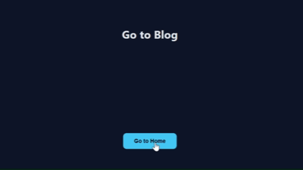
});The "holy grail" of web design. Instead of a jarring jump between pages, an overlay "curtain" wipes across the screen, hides the change, and then reveals the new content.
What it does:
ScaleY Animation: Animates the scaleY of a full-screen div from 0 to 1.
The "Switch" Hook: Uses .add() to pause mid-animation and swap the content (or trigger a page load) while the screen is fully covered.
Origin Swap: Changes transformOrigin to "bottom" for the exit, so the curtain feels like it’s being pulled down.
Why it’s attractive: It creates a seamless "App-like" feel that makes a website feel integrated and professional.
Preview:
HTML:
<div class="transition-overlay"></div>

<div class="page">
  <h1>Home Page</h1>
  <button class="nav-btn">Go to Blog</button>
</div>

<script src="https://cdn.jsdelivr.net/npm/gsap@3/dist/gsap.min.js"></script>
CSS:
* {
  box-sizing: border-box;
}

html, body {
  margin: 0;
  height: 100%;
  font-family: system-ui, sans-serif;
  background: #0f172a;
  color: #e5e7eb;
}

/* Page content */
.page {
  height: 100%;
  display: grid;
  place-items: center;
  gap: 24px;
}

.nav-btn {
  padding: 14px 32px;
  background: #38bdf8;
  color: #020617;
  border: none;
  border-radius: 10px;
  cursor: pointer;
  font-size: 16px;
  font-weight: 600;
}

/* Transition overlay */
.transition-overlay {
  position: fixed;
  inset: 0;
  background: #020617;
  transform: scaleY(0);
  transform-origin: top;
  z-index: 9999;
}
Javascipt:
const overlay = document.querySelector(".transition-overlay");
const button = document.querySelector(".nav-btn");
const h1 = document.querySelector('h1');

const transition = gsap.timeline({
  paused: true,
  defaults: { ease: "power3.inOut" }
});

transition
  .to(overlay, {
    scaleY: 1,
    duration: 0.5
  })
  .add(() => {
    // Simulate page/content change
  if(h1.textContent == 'Go to Blog'){
      h1.textContent = 'Go to Home'
      button.textContent = 'Go to Blog'
    }else{
      h1.textContent = 'Go to Blog'
      button.textContent = "Go to Home";
    }

  })
  .to(overlay, {
    scaleY: 0,
    transformOrigin: "bottom",
    duration: 0.5
  });

button.addEventListener("click", () => {
  transition.play(0);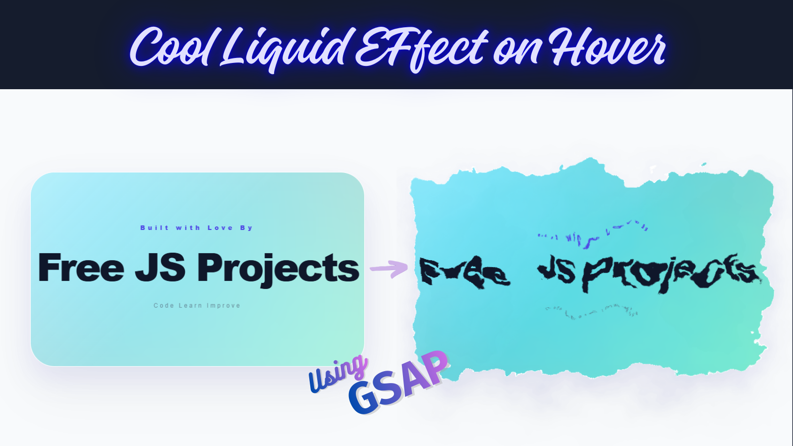
});This effect is the "Showstopper" for Light Mode. It transforms a clean, professional card into a fluid, iridescent pool of glass. Using a Mesh Gradient and SVG Displacement, it creates an organic "ink-in-water" feel that is impossible to ignore.
The "Liquid" look isn't a video or a GIF—it’s live math.
The Engine: <feTurbulence> generates a fractal noise map.
The Interaction: GSAP maps your mouse velocity to the scale of the displacement.
The Clarity: When stationary, the scale is 0 (perfectly sharp). On hover, it "melts" to a scale of 70, creating the morphing effect.
Preview:

HTML:
<div class="stage">
  <svg style="display:none;">
    <filter id="light-liquid">
      <feTurbulence type="fractalNoise" baseFrequency="0.01" numOctaves="4" result="noise" id="liquid-noise" />
      <feDisplacementMap in="SourceGraphic" in2="noise" scale="0" xChannelSelector="R" yChannelSelector="G" id="liquid-map" />
    </filter>
  </svg>

  <div class="card-container">
    <div class="liquid-card">
      <div class="mesh-bg"></div>
      <div class="glass-reflection"></div>

      <div class="content">
        <span class="badge">Built with Love By</span>
        <h1>Free JS Projects</h1>
        <p>Code Learn Improve</p>
      </div>
    </div>
  </div>
</div>

<script src="https://cdn.jsdelivr.net/npm/gsap@3/dist/gsap.min.js"></script>
CSS:
:root {
  /* Vibrant Light Mode Palette */
  --color-1: #00d2ff;
  --color-2: #92fe9d;
  --color-3: #ff512f;
  --color-4: #dd2476;
}

body {
  background: #f8fafc; /* Clean Light Grey/White */
  height: 100vh;
  margin: 0;
  display: flex;
  justify-content: center;
  align-items: center;
  font-family: "Inter", sans-serif;
  overflow: hidden;
}

.stage {
  perspective: 2000px;
}

.card-container {
  width: 550px;
  height: 320px;
  transform-style: preserve-3d;
  cursor: crosshair;
}

.liquid-card {
  position: relative;
  width: 100%;
  height: 100%;
  background: rgba(255, 255, 255, 0.7); /* Translucent White */
  border-radius: 40px;
  border: 1px solid rgba(255, 255, 255, 0.8);
  display: flex;
  justify-content: center;
  align-items: center;
  filter: url(#light-liquid);
  overflow: hidden;
  /* Soft, colorful shadow for light mode */
  box-shadow: 0 40px 80px rgba(0, 0, 0, 0.05),
    0 20px 40px rgba(99, 102, 241, 0.1);
  backdrop-filter: blur(10px);
}

.mesh-bg {
  position: absolute;
  inset: -50%;
  background: radial-gradient(circle at 30% 30%, var(--color-1), transparent),
    radial-gradient(circle at 70% 70%, var(--color-2), transparent),
    radial-gradient(circle at 30% 70%, var(--color-3), transparent),
    radial-gradient(circle at 70% 30%, var(--color-4), transparent);
  filter: blur(60px);
  opacity: 0.5; /* Subtle until liquid starts moving */
  transition: opacity 0.5s;
}

.glass-reflection {
  position: absolute;
  inset: 0;
  background: linear-gradient(
    135deg,
    rgba(255, 255, 255, 0.4) 0%,
    transparent 50%
  );
  z-index: 2;
  pointer-events: none;
}

.content {
  text-align: center;
  color: #1e293b;
  z-index: 10;
  pointer-events: none;
}
h1 {
  font-size: 4rem;
  margin: 0;
  font-weight: 900;
  letter-spacing: -3px;
  color: #0f172a;
}
.badge {
  color: #4f46e5;
  letter-spacing: 5px;
  font-size: 10px;
  font-weight: 900;
  display: block;
  margin-bottom: 10px;
}
p {
  opacity: 0.6;
  font-size: 10px;
  letter-spacing: 3px;
  margin-top: 15px;
  color: #475569;
}
Javascript:
const map = document.querySelector("#liquid-map");
const noise = document.querySelector("#liquid-noise");
const container = document.querySelector(".card-container");
const mesh = document.querySelector(".mesh-bg");

container.addEventListener("mousemove", (e) => {
  const { width, height, left, top } = container.getBoundingClientRect();
  const xPct = (e.clientX - left) / width;
  const yPct = (e.clientY - top) / height;

  // 1. Smooth 3D Tilt
  gsap.to(container, {
    rotateX: (yPct - 0.5) * -25,
    rotateY: (xPct - 0.5) * 25,
    duration: 0.6
  });

  // 2. Liquid Response
  const freqX = 0.01 + xPct * 0.005;
  const freqY = 0.01 + yPct * 0.005;

  gsap.to(noise, {
    attr: { baseFrequency: `${freqX} ${freqY}` },
    duration: 0.5
  });

  // Turn liquid ON & Brighten Colors
  gsap.to(map, { attr: { scale: 70 }, duration: 0.4 });
  gsap.to(mesh, { opacity: 0.8, scale: 1.2, duration: 0.5 });
});

container.addEventListener("mouseleave", () => {
  // Reset to static clean card
  gsap.to(container, {
    rotateX: 0,
    rotateY: 0,
    duration: 1.2,
    ease: "power2.out"
  });
  gsap.to(map, { attr: { scale: 0 }, duration: 0.8 });
  gsap.to(mesh, { opacity: 0.5, scale: 1, duration: 0.8 });
});You’ve now explored 15 distinct interactive effects, ranging from simple 3D tilts to this complex Liquid-Glass Morph. By mastering these, you’ve gained a massive edge in the world of creative web development.
The best developers don't just copy code; they combine it. Try taking the "Magnetic Button" from Effect 4 and placing it inside the "Liquid Card" of Effect 15. The possibilities are infinite.
Happy Coding..!🚀

Comments